American Tire Distributors (ATD)
Product Summary
At American Tire Distributors (ATD), a leading B2B e-commerce company with $5.7 billion in annual revenue, I led UX improvements to refine the product listing and checkout experience on ATD.com. By addressing key usability gaps in navigation, filtering, and order transparency, we reduced friction for customers and improved conversion on one of the largest tire distribution platforms in North America.
Challenge
ATD's digital platform faced significant usability challenges that directly impacted both customer satisfaction and business performance. In a $5.7B B2B environment where dealers place high-value, high-volume tire orders, even small UX inefficiencies created compounding costs in support, refunds, and trust:
- Navigation was inconsistent and unintuitive, slowing down staff workflows.
- Freight charges appeared late, often surprising dealers and creating frustration around perceived hidden fees.
- Checkout lacked transparency, with no order summary and limited payment methods, increasing the risk of costly errors.
- Error handling and returns created operational overhead, leading to avoidable support calls and refunds.
The goal was to simplify the end-to-end journey from browsing tires to completing an order. Dealers needed confidence that their transactions were accurate, transparent, and manageable at both staff and manager levels, without disrupting ATD's high-volume business processes.
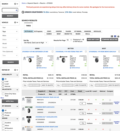
Image 1: The previous product list page used unclear descriptions, inconsistent imagery, and offered limited filtering, making it harder for users to compare products.
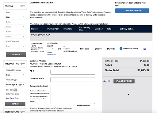
Image 2: Before redesign, the checkout was a single page with no order summary, unclear shipping breakdowns, and restricted payment choices.
Insight
We analysed customer support data, as running contextual enquiries at scale was not feasible. This revealed recurring complaints: freight charges changing at checkout, lack of an order summary, and poor error handling that led to abandoned orders. Guided by these insights, we carried out archetype mapping and narrowed our focus to two key groups, single-dealer and multi-dealer buyers. Instead of diluting improvements across all personas, we made a strategic decision to prioritise transparency and speed for these two groups, doubling down on solving checkout friction where it mattered most.
Image 3: Mapped five customer archetypes and prioritised single-dealer and multi-dealer users to focus improvements where they would deliver the greatest impact.
Solution
I led iterative design and prototype testing to address the most critical friction points, grounding decisions in both user insights and Baymard Institute research. Using industry benchmarks helped me shift stakeholder perception, moving the conversation from "cosmetic redesign" to functional product improvements with clear business impact.
Product List Page Improvements
- Introduced advanced filtering and comparison tools.
- Standardised imagery and enriched product descriptions.
- Simplified layout to reduce cognitive load.
(These were important, but the greatest impact came from transforming the checkout experience.)
Checkout Flow Enhancements
- Transparent order summary: Introduced a review modal that allowed buyers to verify product, freight, and cost details before finalising, directly addressing both user complaints and Baymard's top checkout guidelines.
- Flexible payment methods: Expanded to three payment options. This decision balanced user expectations with operational constraints, covering the majority of dealer needs while avoiding unnecessary back-end complexity.
- Clearer shipping breakdown: Eliminated hidden costs by presenting upfront, itemised freight charges, resolving one of the most consistent sources of support tickets and abandoned orders.
- Error handling: Redesigned validation and feedback to minimise costly mistakes during order submission.
By linking each decision to research-backed best practices and recurring customer frustrations, I secured stakeholder approval for what had initially been dismissed as "a design issue." Framing checkout as a revenue-critical function helped unlock resources for prototyping and testing, ensuring the improvements were validated across both internal stakeholders and external users.
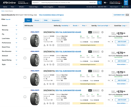
Image 4: Enhanced the product list page with smarter filtering, clearer product information, and consistent, high-quality imagery.
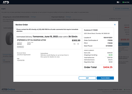
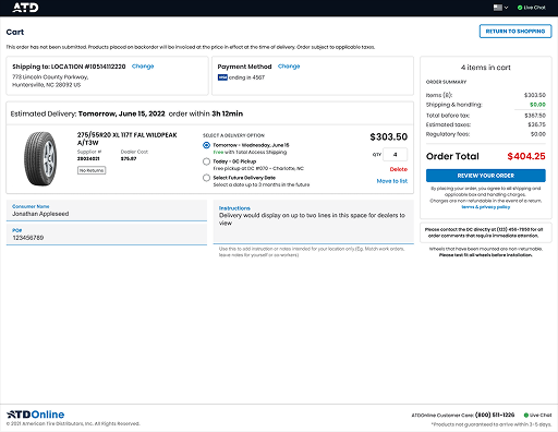
Image 5: Redesigned checkout with a modal flow, clearer costs, flexible payments, and a more reliable confirmation process.
Outcome
Before the redesign, dealers frequently raised complaints about freight charges appearing late in the process, which came across as hidden fees. Errors in orders, especially when staff mistakenly selected the wrong tires, created costly refunds and time-consuming change requests. By introducing a confirmation modal, clearer shipping breakdowns, and a hierarchical approval step (staff submit, manager approves), we significantly reduced order mistakes and support interventions. Complaints about hidden charges fell sharply, and dealers reported greater confidence in the platform.
Alongside these workflow-level improvements, prototype testing validated measurable gains across both stakeholders and external users:
- 25% faster task completion times
- 85% of participants preferred the redesigned flows
- 15% fewer checkout errors
- 12% fewer support calls related to wrong purchases/refunds
- 5% uplift in completed orders
At ATD's scale, a company processing over $5.7B annually, even these incremental improvements represent significant value in both customer experience and operational efficiency.
Image 6: Reduced errors, fewer freight-charge complaints, and increased dealer confidence, all validated through stakeholder sessions and user testing.
Reflection
This project highlighted the importance of framing design changes as functional and business-critical improvements, not cosmetic fixes. By tying usability issues to Baymard research and recurring dealer complaints, I was able to secure stakeholder buy-in and prioritise checkout clarity over less urgent features. If given more time and resources, I would have explored predictive inventory and freight optimisation, but focusing on transparency and error reduction delivered the fastest and most impactful gains in the short term.
American Tire Distributors (ATD)
Product Summary
At American Tire Distributors (ATD), a leading B2B e-commerce company with $5.7 billion in annual revenue, I led UX improvements to refine the product listing and checkout experience on ATD.com. By addressing key usability gaps in navigation, filtering, and order transparency, we reduced friction for customers and improved conversion on one of the largest tire distribution platforms in North America.
Challenge
ATD's digital platform faced significant usability challenges that directly impacted both customer satisfaction and business performance. In a $5.7B B2B environment where dealers place high-value, high-volume tire orders, even small UX inefficiencies created compounding costs in support, refunds, and trust:
- Navigation was inconsistent and unintuitive, slowing down staff workflows.
- Freight charges appeared late, often surprising dealers and creating frustration around perceived hidden fees.
- Checkout lacked transparency, with no order summary and limited payment methods, increasing the risk of costly errors.
- Error handling and returns created operational overhead, leading to avoidable support calls and refunds.
The goal was to simplify the end-to-end journey from browsing tires to completing an order. Dealers needed confidence that their transactions were accurate, transparent, and manageable at both staff and manager levels, without disrupting ATD's high-volume business processes.

Image 1: The previous product list page used unclear descriptions, inconsistent imagery, and offered limited filtering, making it harder for users to compare products.

Image 2: Before redesign, the checkout was a single page with no order summary, unclear shipping breakdowns, and restricted payment choices.
Insight
We analysed customer support data, as running contextual enquiries at scale was not feasible. This revealed recurring complaints: freight charges changing at checkout, lack of an order summary, and poor error handling that led to abandoned orders. Guided by these insights, we carried out archetype mapping and narrowed our focus to two key groups, single-dealer and multi-dealer buyers. Instead of diluting improvements across all personas, we made a strategic decision to prioritise transparency and speed for these two groups, doubling down on solving checkout friction where it mattered most.
Image 3: Mapped five customer archetypes and prioritised single-dealer and multi-dealer users to focus improvements where they would deliver the greatest impact.
Solution
I led iterative design and prototype testing to address the most critical friction points, grounding decisions in both user insights and Baymard Institute research. Using industry benchmarks helped me shift stakeholder perception, moving the conversation from "cosmetic redesign" to functional product improvements with clear business impact.
Product List Page Improvements
- Introduced advanced filtering and comparison tools.
- Standardised imagery and enriched product descriptions.
- Simplified layout to reduce cognitive load.
(These were important, but the greatest impact came from transforming the checkout experience.)
Checkout Flow Enhancements
- Transparent order summary: Introduced a review modal that allowed buyers to verify product, freight, and cost details before finalising, directly addressing both user complaints and Baymard's top checkout guidelines.
- Flexible payment methods: Expanded to three payment options. This decision balanced user expectations with operational constraints, covering the majority of dealer needs while avoiding unnecessary back-end complexity.
- Clearer shipping breakdown: Eliminated hidden costs by presenting upfront, itemised freight charges, resolving one of the most consistent sources of support tickets and abandoned orders.
- Error handling: Redesigned validation and feedback to minimise costly mistakes during order submission.
By linking each decision to research-backed best practices and recurring customer frustrations, I secured stakeholder approval for what had initially been dismissed as "a design issue." Framing checkout as a revenue-critical function helped unlock resources for prototyping and testing, ensuring the improvements were validated across both internal stakeholders and external users.

Image 4: Enhanced the product list page with smarter filtering, clearer product information, and consistent, high-quality imagery.


Image 5: Redesigned checkout with a modal flow, clearer costs, flexible payments, and a more reliable confirmation process.
Outcome
Before the redesign, dealers frequently raised complaints about freight charges appearing late in the process, which came across as hidden fees. Errors in orders, especially when staff mistakenly selected the wrong tires, created costly refunds and time-consuming change requests. By introducing a confirmation modal, clearer shipping breakdowns, and a hierarchical approval step (staff submit, manager approves), we significantly reduced order mistakes and support interventions. Complaints about hidden charges fell sharply, and dealers reported greater confidence in the platform.
Alongside these workflow-level improvements, prototype testing validated measurable gains across both stakeholders and external users:
- 25% faster task completion times
- 85% of participants preferred the redesigned flows
- 15% fewer checkout errors
- 12% fewer support calls related to wrong purchases/refunds
- 5% uplift in completed orders
At ATD's scale, a company processing over $5.7B annually, even these incremental improvements represent significant value in both customer experience and operational efficiency.
Image 6: Reduced errors, fewer freight-charge complaints, and increased dealer confidence, all validated through stakeholder sessions and user testing.
Reflection
This project highlighted the importance of framing design changes as functional and business-critical improvements, not cosmetic fixes. By tying usability issues to Baymard research and recurring dealer complaints, I was able to secure stakeholder buy-in and prioritise checkout clarity over less urgent features. If given more time and resources, I would have explored predictive inventory and freight optimisation, but focusing on transparency and error reduction delivered the fastest and most impactful gains in the short term.