Pearson
Product Summary
Pearson is the world’s leading learning company, with expertise in courseware, assessment and technology-enabled teaching and learning services. Millions of teachers and learners use Pearson products daily. I led the reconstruction of a core educator platform for both general qualifications and vocational awards, migrating from Flash to HTML5 and redesigning key workflows to reduce support calls and improve educator satisfaction.
EXECUTION METRICS
Challenge
The legacy platform ran on Flash and required urgent migration to HTML5. At the same time, the user experience generated avoidable support calls and inefficient educator workflows:
- Confusing navigation during peak exam periods pushed teachers to call support.
- Data views were too complex, forcing exports to spreadsheets for manual analysis.
- Identifying candidates for remark or resits was slow and manual because the system did not support the workflow.

Image 1: Early persona archetypes showing engaged and disengaged teachers and heads of department. These differences in motivation and frustration shaped design priorities.
Insight
Through interviews and contextual research I identified four personas: engaged teachers, disengaged teachers, engaged heads of department and disengaged heads of department. Pain points were consistent: difficulty finding key information under time pressure, over-complex data, and unsupported remark and resit workflows. This reframed the work from a technical upgrade to a product opportunity to reduce workload and restore trust.
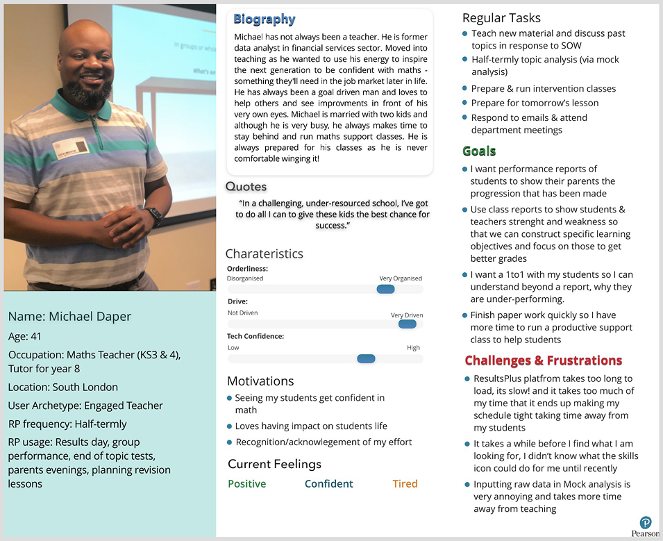
Image 2: Detailed persona created from interviews and contextual research. These captured goals, frustrations and motivations and anchored the redesign in real educator needs.
Solution
I facilitated design workshops with cross-functional teams to align on problem statements and prioritise solutions using Crazy 8s, card sorting and dot voting. We then translated the preferred concepts into interactive prototypes and tested remotely to validate usability across diverse educator contexts.
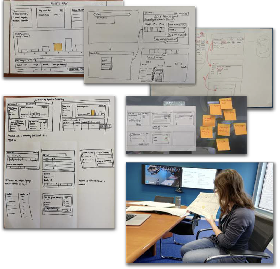
Image 3: Co-design workshops. Structured activities generated a wide range of options and built alignment on what to prioritise.
Key interventions
- Navigation redesign: clearer information architecture for faster access to results and insights.
- Streamlined data views: in-platform reporting and visualisation to reduce reliance on spreadsheets.
- Workflow optimisation: supported remark and resit journeys to cut manual effort and errors.
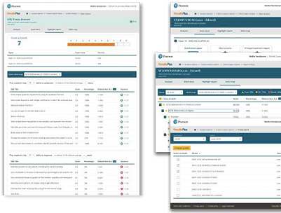
Image 4: Interactive prototypes tested remotely with educators. Remote testing accelerated feedback and ensured the design worked in varied school contexts.
Outcome
The migration and redesign delivered measurable improvements for educators and the business:
- 35% increase in engagement within the first five minutes of login.
- Net Promoter Score improved from -12 to +41.
- Support calls reduced as navigation and reporting became self-serve.
Reflection
Positioning the HTML5 migration as a product opportunity, not just a technical necessity, helped unlock buy-in and focus on the most impactful educator workflows. If I had extended scope, I would have explored predictive analytics to surface at-risk students automatically. Prioritising navigation, data clarity and remark flows delivered fast, visible wins and shifted perception of the platform among both users and stakeholders.
Pearson
Product Summary
Pearson is the world’s leading learning company, with expertise in courseware, assessment and technology-enabled teaching and learning services. Millions of teachers and learners use Pearson products daily. I led the reconstruction of a core educator platform for both general qualifications and vocational awards, migrating from Flash to HTML5 and redesigning key workflows to reduce support calls and improve educator satisfaction.
Challenge
The legacy platform ran on Flash and required urgent migration to HTML5. At the same time, the user experience generated avoidable support calls and inefficient educator workflows:
- Confusing navigation during peak exam periods pushed teachers to call support.
- Data views were too complex, forcing exports to spreadsheets for manual analysis.
- Identifying candidates for remark or resits was slow and manual because the system did not support the workflow.
Image 1: Early persona archetypes showing engaged and disengaged teachers and heads of department. These differences in motivation and frustration shaped design priorities.
Insight
Through interviews and contextual research I identified four personas: engaged teachers, disengaged teachers, engaged heads of department and disengaged heads of department. Pain points were consistent: difficulty finding key information under time pressure, over-complex data, and unsupported remark and resit workflows. This reframed the work from a technical upgrade to a product opportunity to reduce workload and restore trust.
Image 2: Detailed persona created from interviews and contextual research. These captured goals, frustrations and motivations and anchored the redesign in real educator needs.
Solution
I facilitated design workshops with cross-functional teams to align on problem statements and prioritise solutions using Crazy 8s, card sorting and dot voting. We then translated the preferred concepts into interactive prototypes and tested remotely to validate usability across diverse educator contexts.
Image 3: Co-design workshops. Structured activities generated a wide range of options and built alignment on what to prioritise.
Key interventions
- Navigation redesign: clearer information architecture for faster access to results and insights.
- Streamlined data views: in-platform reporting and visualisation to reduce reliance on spreadsheets.
- Workflow optimisation: supported remark and resit journeys to cut manual effort and errors.
Image 4: Interactive prototypes tested remotely with educators. Remote testing accelerated feedback and ensured the design worked in varied school contexts.
Outcome
The migration and redesign delivered measurable improvements for educators and the business:
- 35% increase in engagement within the first five minutes of login.
- Net Promoter Score improved from -12 to +41.
- Support calls reduced as navigation and reporting became self-serve.
Reflection
Positioning the HTML5 migration as a product opportunity, not just a technical necessity, helped unlock buy-in and focus on the most impactful educator workflows. If I had extended scope, I would have explored predictive analytics to surface at-risk students automatically. Prioritising navigation, data clarity and remark flows delivered fast, visible wins and shifted perception of the platform among both users and stakeholders.